Sector
Education, eCommerce
Challenge
Providing a userfriendly and engauging credit education platform that retains user's attention and time; thus increasing the likely hood for recommendations/ affiliate sales.
My Role
UX, Branding, Graphic Design (for eBook), web developer
Tools Used
Serverless Hosting, Form Submission / CRM API's - FormSubmit and MailJet, Affinity Designer, Framer, Color Theory, Media Managing API - UploadCare, Git
Modernized Credit Educationon a Scalable Infrastructure
Research
Why do I need credit?
To help me understand how site users navigate and what fuels their browsing/purchase decisions. I arranged meetings with people that fit the target audience and ask them how poor credit or their current credit rating affects their lifestyle.
Results
Users are not aware of how credit bureaus work with lenders
Credit builders are not knowledgeable about how to dispute an inaccuracy on their credit report
How can we communicate our resources and have a strong brand voice?
- Establishing a manifesto
- Restructuring the approach of product delivery
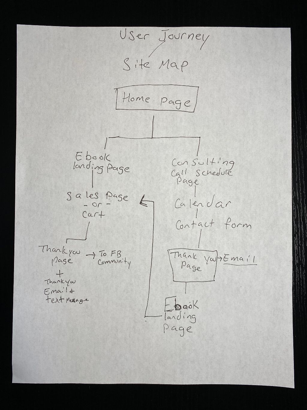
Process Journey map
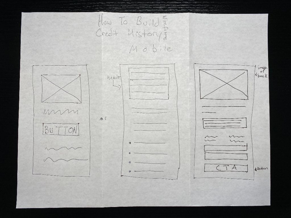
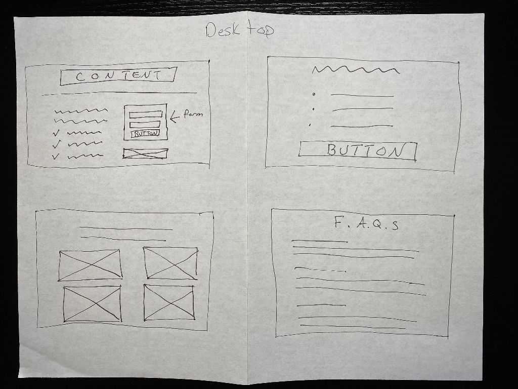
Highlighting the resources On the e-book page there are a few paragraphs
Setting up the checkout page


The form, first revision
To air on the side of brevity and to reduce the number of “bounced” customers, The form is very simple. Starting off with name, email, and number.
Community and commitment
After completing and submitting the form the user is directed to a confirmation page that thinks them for their purchase and ask them to join the credit history group on Facebook. This aims to build a sense of community and that the brand is committed to adding them on their credit journey.
Conclusion
Althought I am unaware of data about the marketing campaign, the expierience of building the landing page and checkout components for the product was enlightening and challenging.